Matt Abbiss produces short animations that are made using either flash animation or hand drawn frame by frame. the flash animations seems to either have a black background and using bright colours for the animation itself or bright backgrounds, like white, yellow, etc, with dark drawings, I feel this is to provide contrast to keep the animation easy and interesting to watch.
something else that i’ve noticed is that his animation have no story for the most part, having simple animations that are matched to the sound. Most of these animations are labeled as untitled, this might be due to a naming theme or due to being unable to give it a proper name due to the fact that its an animation comprising of random movements.
Abbiss uses roughly drawn geometric shapes, such as squares and triangles as well as lines which move in a random fashion.
The animation, for an instant, changes from shapes moving and changing at random to what seems to be a curvature of a planet with satellite like objects moving above it. The animation then abruptly changes back to its original form.
The sound track used for this seems to be collection of popping and whirring sounds to match the movements of the shapes.
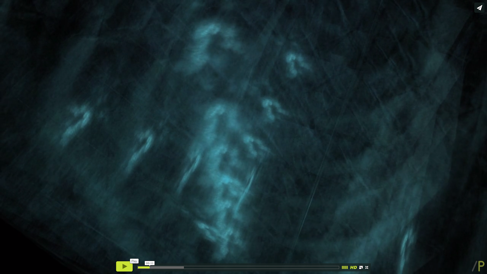
Another animation I’ll be looking at is called Navigations #1 which can be found at the link below:http://animateprojects.org/films/by_date/20141/navigations
the animator, Iain Gardner, describes the process of creating the animation. He goes to say ‘
Thin water absorbent paper was cut in scale with laboratory petri dishes and immersed in an inky solution, replicating the three dimensional mesh cancer cells are grown within the laboratory. Once dried out, these layers of stained paper were photographed and animated within a three dimensional digital space.’ I find this to be incredibly interesting in terms of style and the way is was produced. I do however find this hypnotic and to make me feel lethargic. I think this is due to soft movements in the animation, where the layers move and rotate in the animation.
Please click on the video to view in Vimeo:
Navigations from Animate Projects on Vimeo.

Please click on the video to view in Vimeo:
Navigations from Animate Projects on Vimeo.
This animation, Paint Unpaint (http://animateprojects.org/films/by_date/20141/paint_unpaint), is an animation the recreates a section of the Film Jason Pollock 51 (Namuth, H) where the artiests paints on glass installed between Pollock and the camera to create this animation.
The synopsis attached to this video goes on to say, ‘Namuth’s and Pollock’s collaboration could already be seen as a form of animation where Pollock’s well-known drip paintings became alive and resulted in a moving image. By redrawing the film using today’s technology Paint Unpaint updates this 1950s experiment and integrates the painter and painting into a new moving painting’. What caught my eye about this animation is that once its reaches a certain point its reversed, making it look like the artist is erasing the work he has previously done.
The style of the animation is that of rotoscope, where the animator draws over the orgional film to give it a flat, 2D appearance
Dawn of the Cat
This animation used 3 mediums and then combines them to create striking visuals. The mediums used are live action footage, for the actors faces and occasional their limbs, 2D for the bodies of the characters and their pets, and finally special effects to create a crumpled paper effect. all these are brought together to create a non-linear story ( the story is told from end to beginning rather than the usual order.
I like this style as it bring together forms of animation which I would like to try for my experimental animation as well as creating a non-linear storyline.
Dreamin' About The Future ~ Will.i.am & Yuri Suzuki - Pyramidi
This is a music video for Will I Am’s music video, We've been dreaming about the future, which was shown at the Barbican. This animation had the illusion of that the face of Will I Am would follow the viewers around the room. This was achieved by have the animation projected on to a canvas which had an indentation which the face would be shot in to.
The animation itself was created using 3D and perhaps Mo Cap to record the artists face, if this is the case this would cut down the animation time considerably as well as making it far easier to replicate his facial movements.
Also, in front of the projection there was 3 cases which contained instruments which would react to flashes in the animation by moving and creating sound.
what also interests me in this video is the ancient egyptian theme used in this video, which influenced the colour pallet of this. Using, golds, blues, whites and reds as well as using head dresses from that period. What also caught my eye is the background animations used. which to me looked like rays of light beaming past the face.
No comments:
Post a Comment